What’s in a name? Apparently Game of Thrones, Breaking Bad, Marvel and more
(By Rachel Lewis, Editorial Team)
I’ve been thinking about data journalism recently and at the Editorial team in Digital Publishing we’re often at the end of the process. We make the data look visually striking and pull out the interesting stories but we never truly analyse the data. So, over the last two weeks- with my ‘I love spreadsheets’ mug in hand- I tried my luck at analysis, and I figured what better place to start than baby names. If I’m completely honest, it’s been dangerously fun and now I feel like I could win hands down at any pub quiz on TV, film and music influenced names.
How to start finding interesting baby names
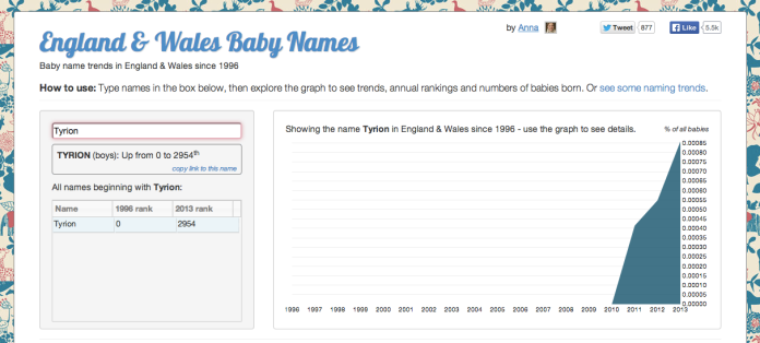
I started by using an awesome interactive created by Anna Powell-Smith who now works for the GDS. I’ll give you some hints at the end of the post on some cool names you can check out for yourself. The interactive can trawl through the full spread of baby boy names and baby girl names from 1996 to 2013. Although, it excludes names that occurred less than 3 times for anonymity reasons, so if you know a Gandalf and they’re not on the list, it’s probably for that reason. In fact, we liked Anna’s interactive so much we promoted it in our listicle.

I used IMDB to search for the most popular TV programmes and films between 1996 and 2013 and some obvious favorites came up- Breaking Bad, Game of Thrones, Amelie and more. I then carried out a search on Wikipedia for character lists such as this one for Game of Thrones and just typed them all into the interactive to see what trends would pop up.
Which TV, film and music names were popular?
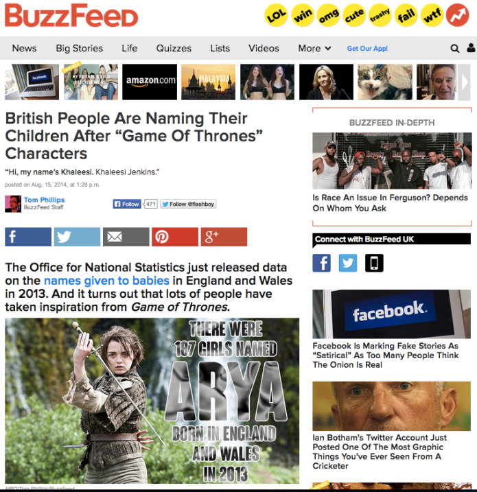
Interestingly, the charts showed a rise in a number of GoT names: Bran, Sansa, Arya, Theon, Tyrion and even Khalessi. Breaking Bad names Skyler and Walter were rising hits. There were even names from Disney like Boo, Sully and Bambi. Harry Potter names had a big influence like Hermione, Sirius, Bellatrix and Draco. Also, unique names from books such as Renesmee from Twilight and Aslan from the Narnia books showed up too.
Once I started, the whole division was in on it, people were giving me suggesting whilst I was making coffee, and I was asking friends and family. We found trends for Miley, Kanye, Zayn, Beyonce, Thor, Loki and more. Obviously the hardest part was choosing the most statistically sounds trends. We aimed for ones that could clearly relate their rise in popularity to an event, such as the release of Amelie and the final Twilight film.
How did we create the infographics?
Once we narrowed it down to 13 facts, this part was the digital mastery of Chris in our design team. He explains it here:
“The key was focussing on celebrities within the list that had that one distinguishing feature in their appearance that people would instantly recognise (i.e Harry’s orange/ginger hair, William’s receding hairline, etc.). If they didn’t have that, it was identified that illustrating that person wouldn’t work…”
How did they go down in the media?
The coverage was really exciting on Friday, with some pretty entertaining banter going on. Our graphics got lifted in The Indie, Guardian, Mail Online as well as popular baby names sites like British Baby names. It was great to see people talking about statistics from such wide backgrounds, from the Financial Times to Buzzfeed.
My favorite tweet was definitely ‘You can’t be Sirius.’ Here Lauren Bradford, Social Media Manager @ONS talks about the reaction on social media, some initial metrics and which posts were most popular:
“Baby Names is one of my favourite releases as it’s interesting content that anyone can relate to and understand. We tweeted throughout the day with snippets from the listicle and tagged all our posts with #babynames, which has had 674 mentions since Friday, and we used #GameofThrones which is already a hugely popular hashtag (average around 5,000 mentions every day). Channels such as QI, BBC Newsbeat and Netmums sharing the content also helped raise the visibility and engagement of the content. We scheduled some of our most popular posts to republish in the evening and over the weekend and the appetite was certainly still there.
A bit of analysis from the posts we put out…The average number of impressions (number of times a tweet is seen) was greater for our content posted in the morning, at 10,593, compared to an average of 7,076 in the evening. To put that into context, the average number of impressions across all of our posts over the last 9 months is 6,250. Our evening posts had a better rate of engagement, with less users overall seeing the content but a higher percentage interacting with it. However, the greatest overall volume of engagement took place in the morning so although interest in the content continued strongly throughout the day, the first hour following the release was when the content had the greatest impact.
Total engagements looks at the total number of times someone has interacted with a tweet. This includes all clicks anywhere on the tweet including hashtags, links, avatar, username, and tweet expansion, retweets, replies, follows, and favourites. All of our #babynames tweets had a good level of engagement, with an average of 624 total engagements across all posts, while the average total engagement across all of our posts over the last 9 months is 105. In terms of the content itself, the TV and celebrity content was the best performing across all metrics. The slope graphs were also strong and the first post of these drew the most clickthroughs to the website content (354 clicks).
Of the two Facebook posts we published (the slope charts together, and the listicle as an album), the charts had the most overall engagements (3,722), with the listicle only slightly less at 3,310. However when looking at overall engagement rate, again comparing engagements over impressions, the listicle was by far the most popular at 46%, compared with 10% for the slope charts.”
How can you find your own interesting names?
I promised I’d give you some tips so here you go if you’re feeling curious. The top 100 names historical trends tables are pretty interesting, they go all the way back to 1904, try looking for your grandparents’ names and see how much they’ve changed over time, or how movements in the 60s and 70s affect naming trends. Also, here’s the trends data behind the interactive, with the entire spread of names between 1996 and 2013. Have fun.

2 comments on “What’s in a name? Apparently Game of Thrones, Breaking Bad, Marvel and more”
Comments are closed.